Trello Toggle View Feature
- Figma
- Trello
- Google Sheets, Forms & Docs
- Google Docs
- Whimsical
- Zoom
- Miro
Trello is a Kanban-style, list-making application accessible on desktop and mobile devices. As a versatile tool for personal or business purposes, their goal is to make managing projects and organizing easy, free, flexible, and visual.
I’m very intrigued and excited about productivity tools, like Trello, because they have been so essential to my ability to manage a busy life and collaborate with others on projects or tasks. While I am a huge fan of using Trello, I also wondered if there were others who share my struggles with viewing and navigating boards with many lists and cards, especially on the mobile app.
The Challenge
So, a design problem I wanted to solve was how to add a feature that could improve the usability and navigation of the Trello board layout.
When viewing the current Trello board on both the desktop and mobile application, a feature that seemed missing from the interface was a toggle view that was flexible for the users’ needs. Sometimes, a board with many lists and cards could be overwhelming to navigate; and scrolling horizontally seemed not only a pain point, but also unintuitive on the desktop version.
Research
To identify gaps in data for a proposed feature that could improve the navigation and visualization of the interface, I began with a discovery phase of research guided by the following goals:
GOALS
1 Determine what are the current use of Trello and other productivity applications for competitive analysis
2 Understand the process for how people navigate and use Trello
3 Identify the user goals, pain points, and motivations for using Trello and other productivity tools
4 Gather feedback on how a new feature would be best received and explored

PRIMARY RESEARCH
10 Trello users were surveyed using Google forms. From that group, I chose 5 to interview for an in-depth discussion about their experience of Trello’s layout and navigation.
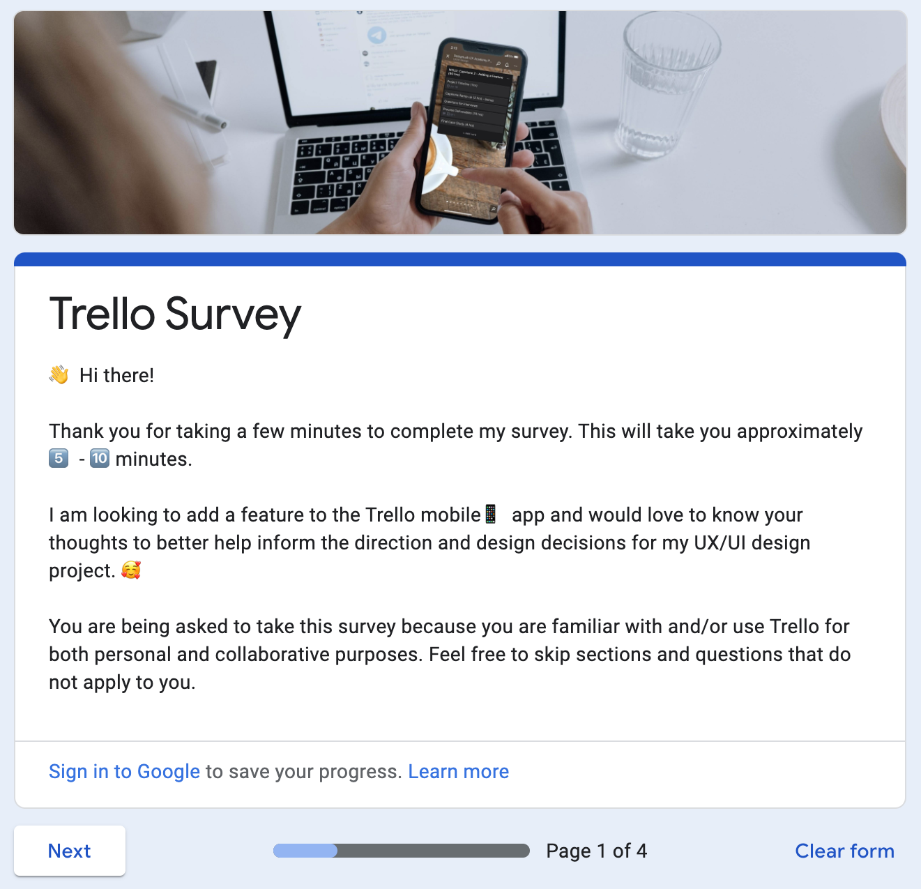
Below are some response trends that were gathered from this initial survey:
Participants were between the ages of 23-29, with 90% working in the tech industry.
60% of users mostly use the Desktop application because they like being able to see more on the larger screen. The other 40% use both Desktop and Mobile versions. The Mobile version was only used to check statuses or if there wasn’t access to a computer.
One quote that seems to capture a common user frustration and need was:
“For both [desktop and mobile]: it’s hard to scroll side to side through lists if you have like 6+ lists on the same board”
Find more details about the survey questions and summary of responses here:
Insights & Findings
Based on their survey responses, the interviewees were asked questions guided by 5 categories. Here are some sample questions and responses from each of the interview question categories I explored which helped me to evaluate my hypothesis based on user needs, pain points, and feedback on the navigation & layout of Trello.
1 General use:
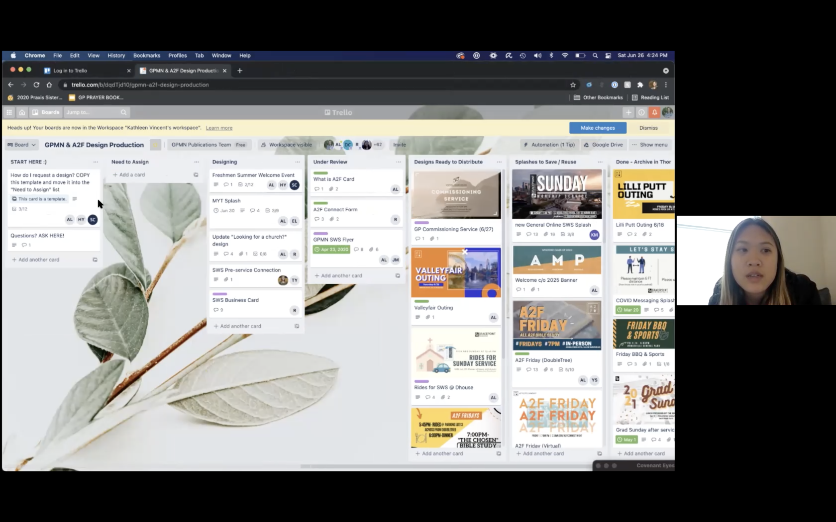
What role does Trello play in your life and how often do you use it?
Participant K uses the Trello board as part of the design production review process. Other participants used Trello for grocery shopping list, to-do list for design projects, and something like a reference dashboard for design assets.
2 Task-oriented:
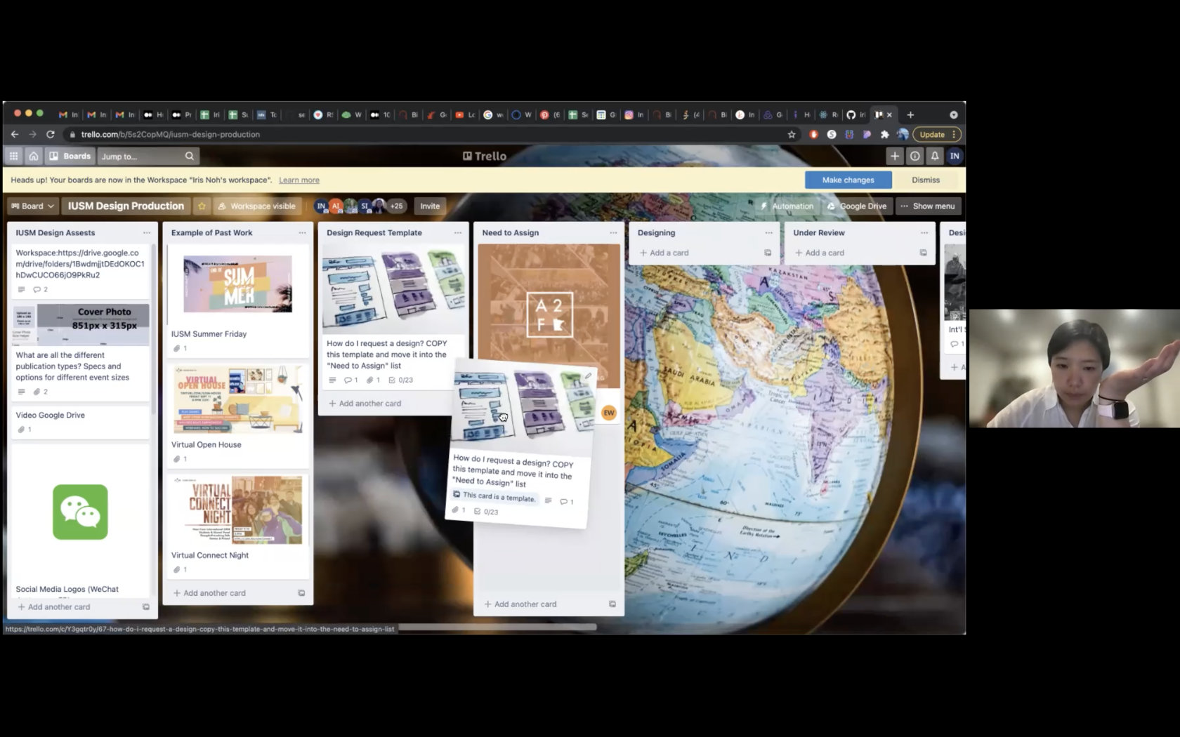
What are the top 3 tasks you complete in Trello?
Participant I shared that her most common task was to move cards to other lists. She also assigned cards to other people on her design team and archived cards when the task was completed.
3 Feature-specific:
What feature(s) do you feel Trello is missing and why?
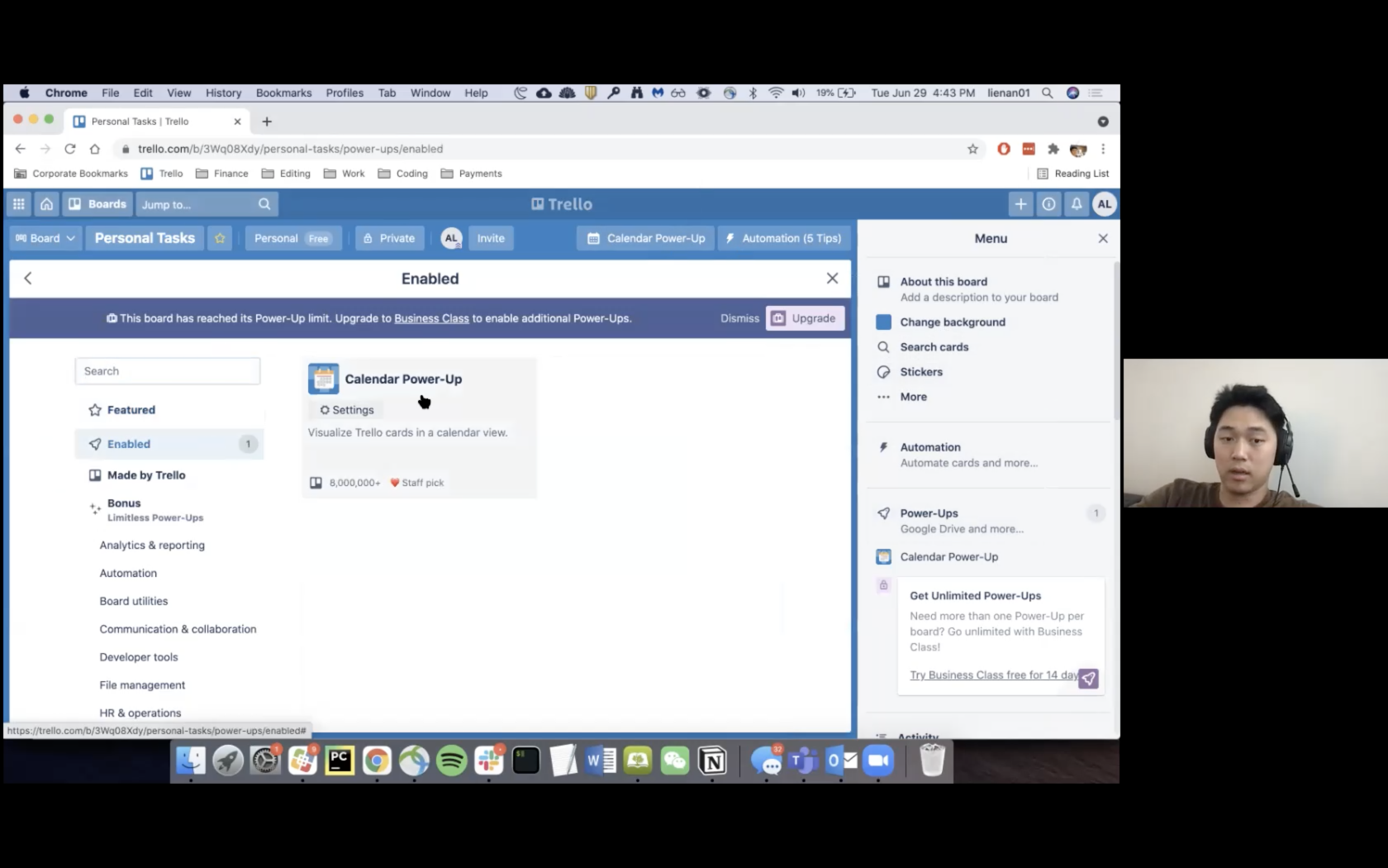
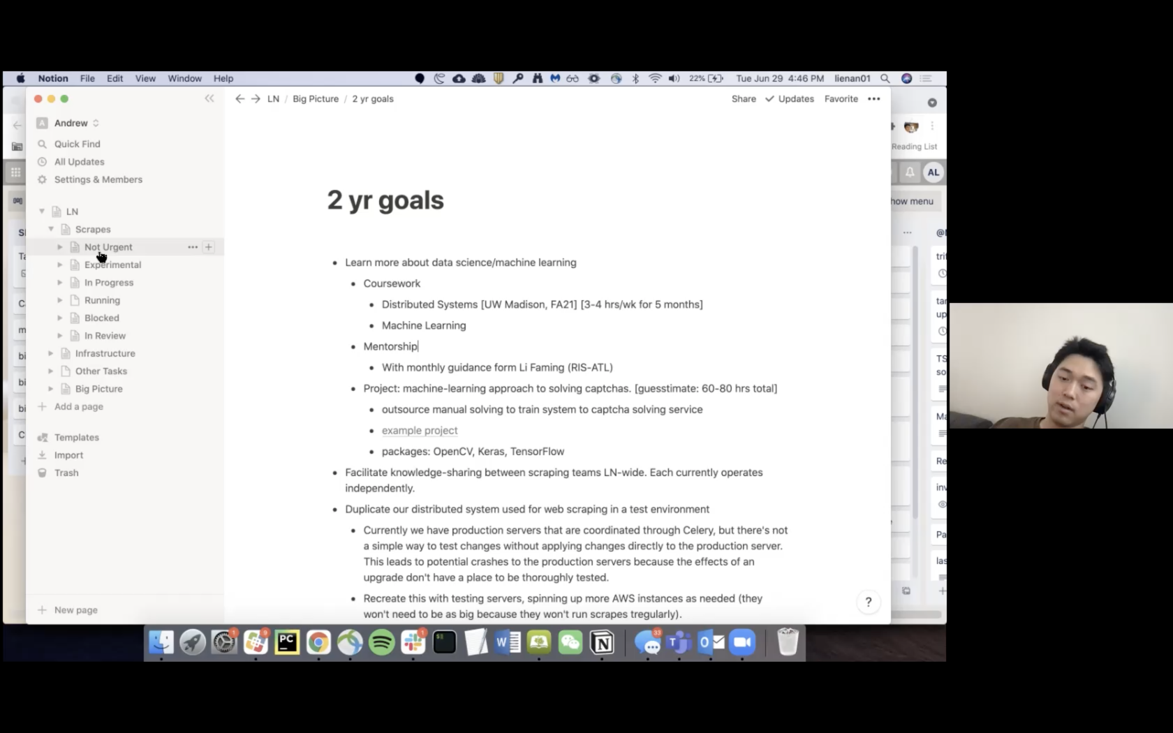
Participant A shared that “as it is, Trello is a little constrained, but it becomes extremely flexible with the use of power-ups. The most common limitation is people not knowing what power-ups are available to them.” He showed me how to access these third-party developed features that allow the user to have more control over customizing their view as well as other ways of using Trello.
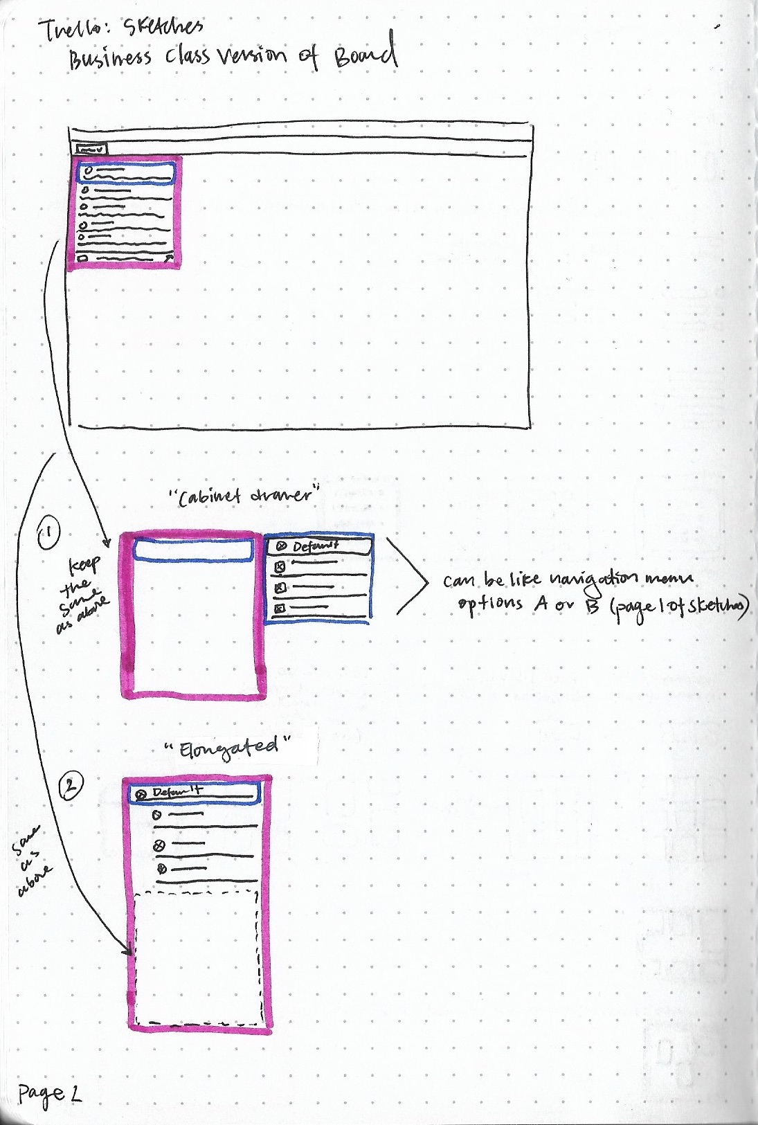
Another participant subscribed for the trial version of the business class viewing features, such as the Calendar view, because the free version of Trello does not have these viewing options. This led me to consider adding the toggle view feature into this element of the Trello board.
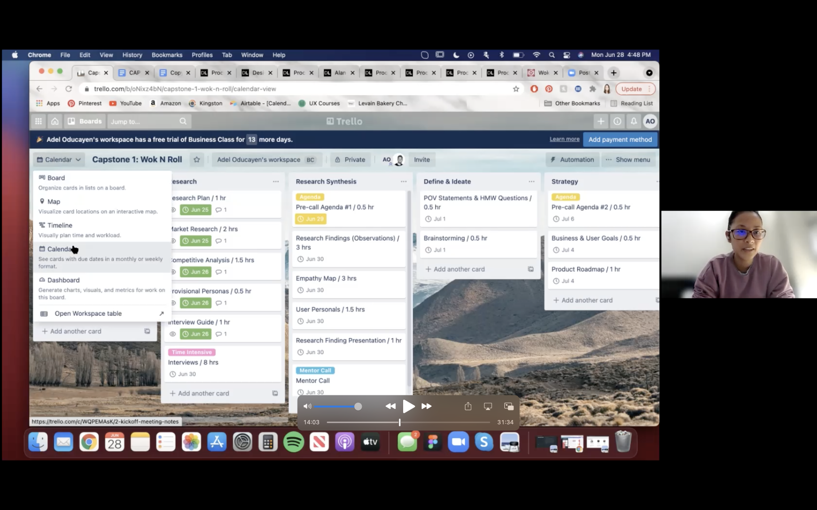
4 Competitors
Are there other tools similar or competitors of Trello that you use?
Participant A uses Notion and liked that you can have a nested file structure that has indefinite layers, whereas Trello is limited to workspaces, boards, lists, and cards.
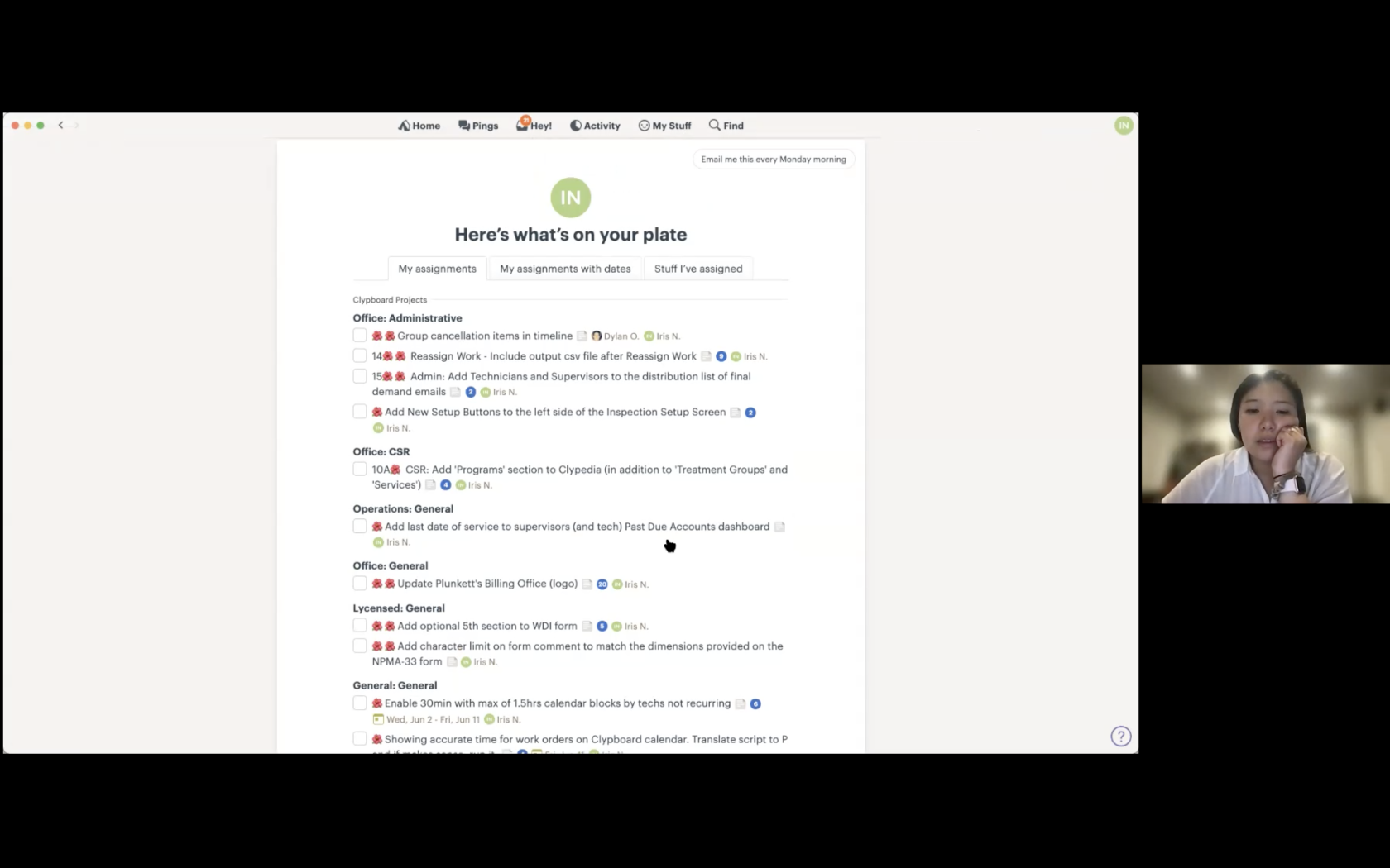
Participant I uses Basecamp for her work tasks, but did not like that she would get too many notifications which were hard to navigate when searching for an assigned task.
5 Other thoughts on Trello UX/UI:
Is there anything else you would like to share with me about Trello that I have not asked?
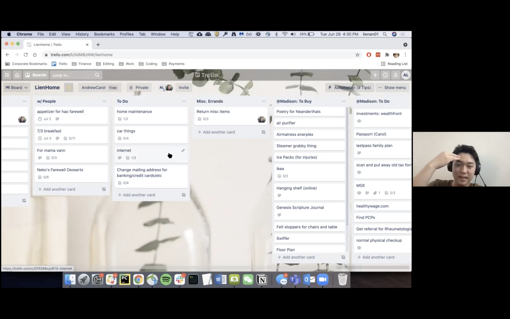
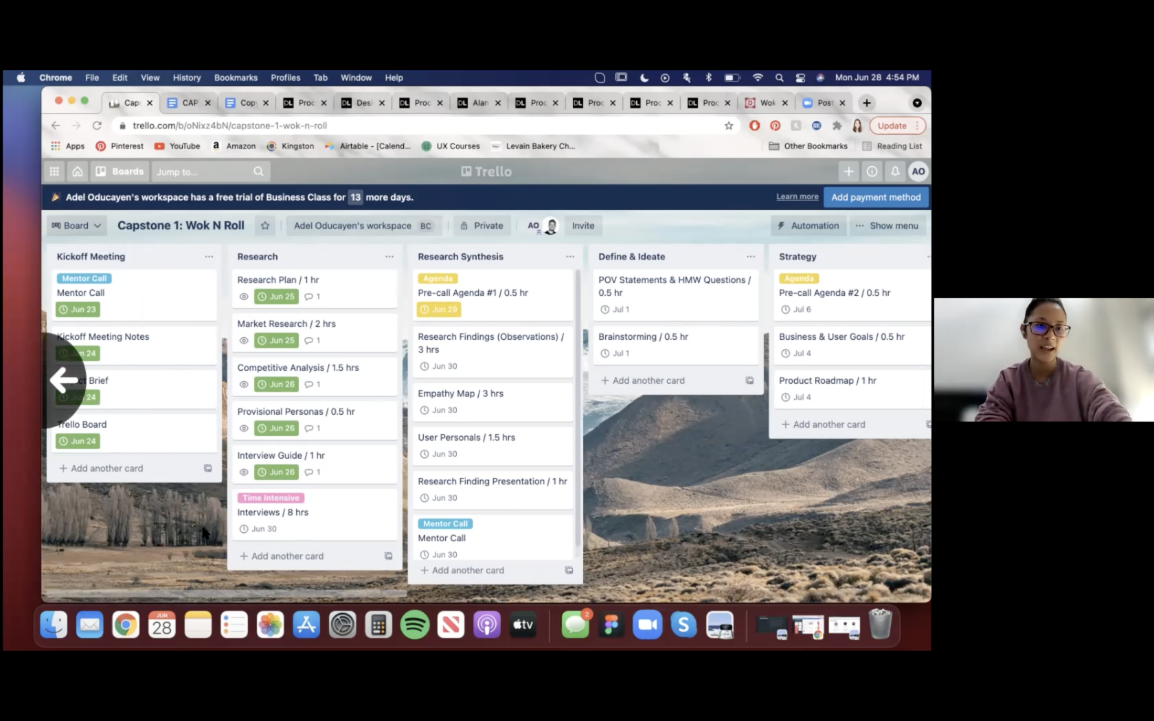
All participants mentioned that horizontal scrolling on the Trello board was frustrating. 2 participants, seen below, explained more in depth why this was a pain point for them.
Participant A found that scrolling right and left on the Trello board was annoying especially if he was looking for a particular thing on mobile view and it would take awhile to find because there may be too many lists to the right.
Participant A experienced a user error when she tried horizontal scrolling with the trackpad of her laptop. Instead of being able to scroll from right to left easily, she would often get sent back to the previous browser page.
SECONDARY RESEARCH & COMPETITIVE ANALYSIS
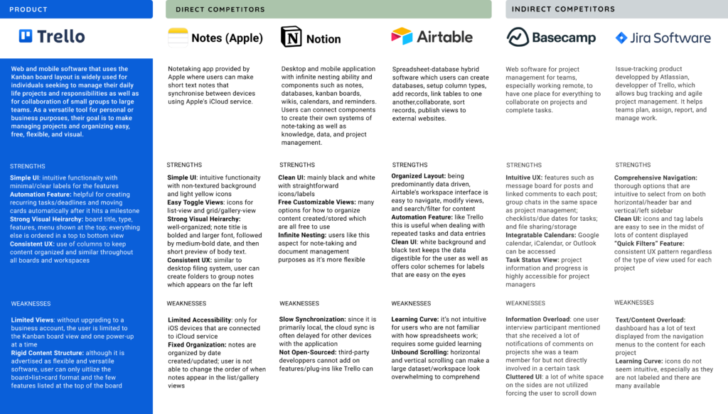
After my learnings from the primary research, I researched and evaluated the following competitors of Trello to understand why users chose to use other productivity software either in addition to Trello or in replacement of it.
PERSONA & EMPATHY MAP
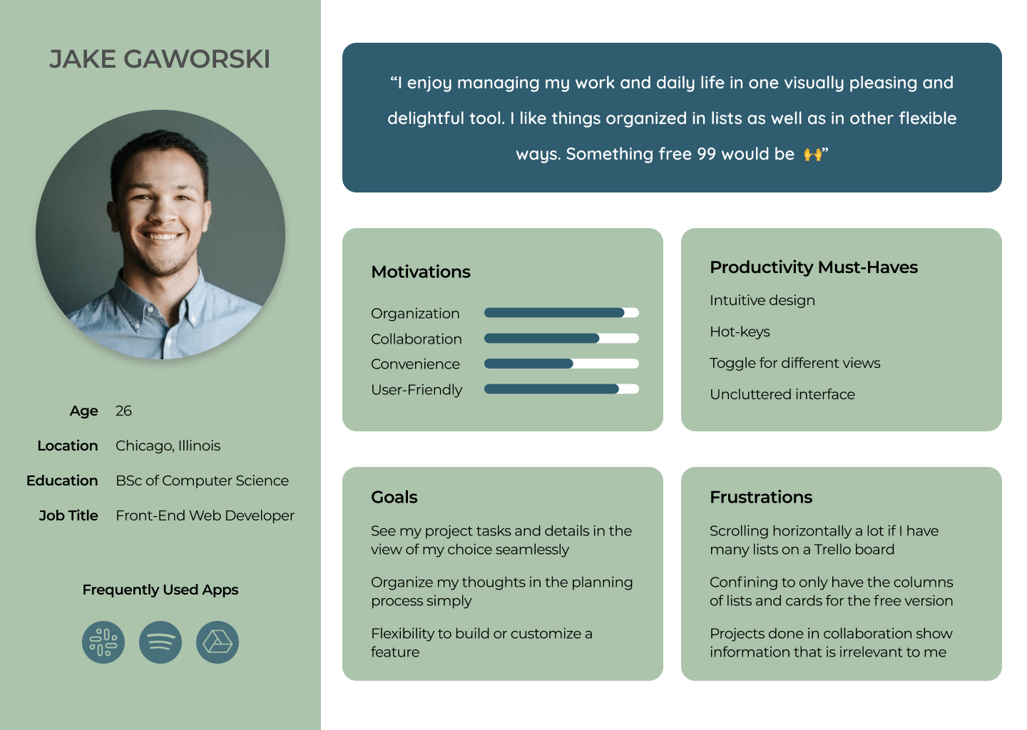
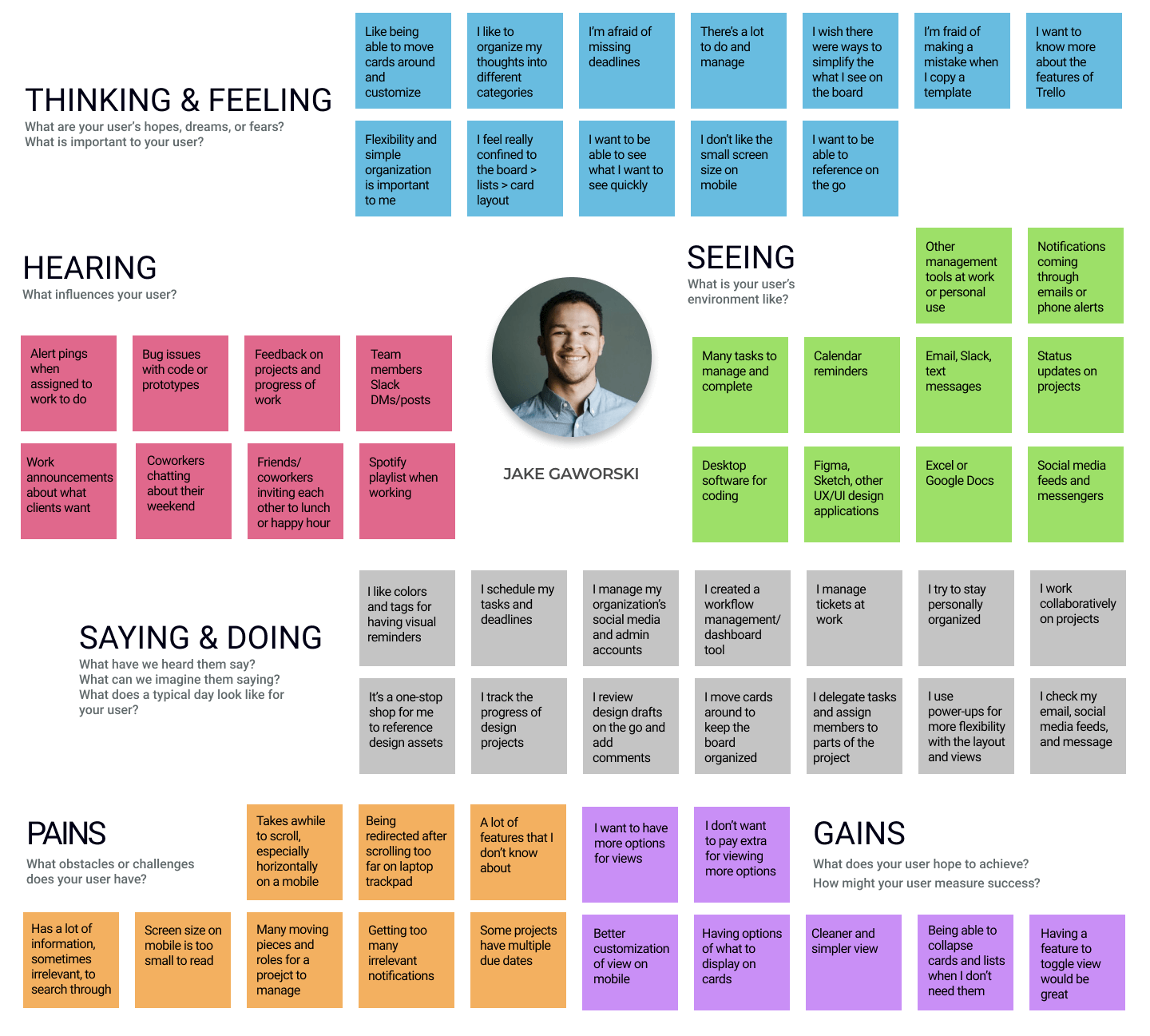
What I learned and heard from the user interviews were documented into an empathy map to find patterns in user motivations, frustrations, and goals. From these observations, I created a user persona whom I could refer back to so that I would ensure my design decisions going forward were user-centered.
Solution
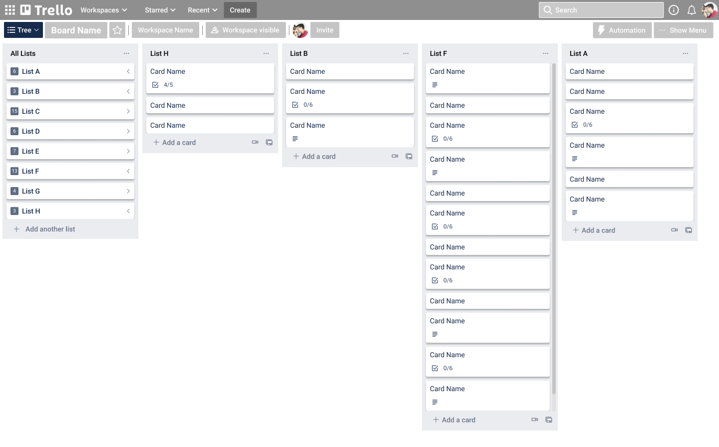
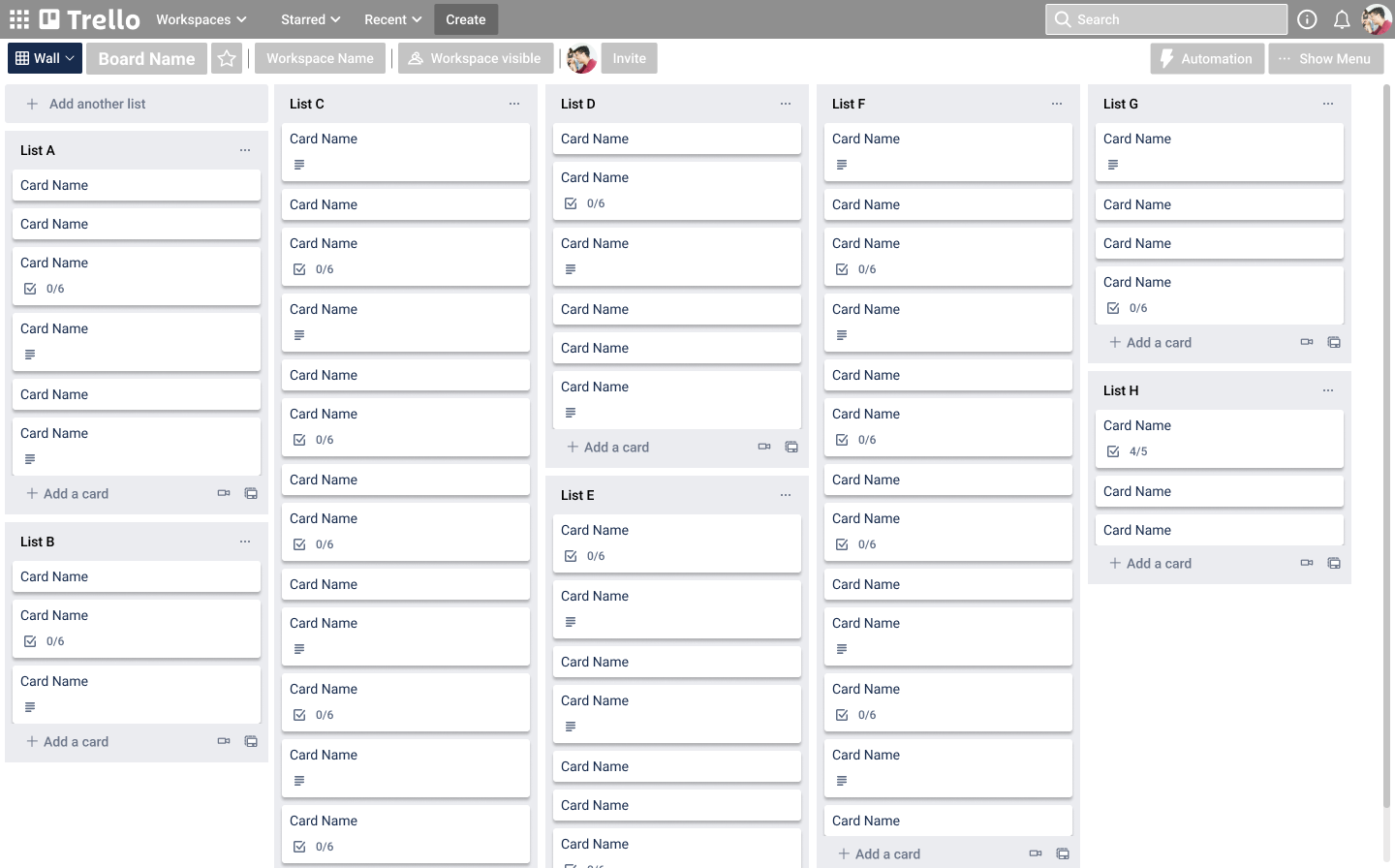
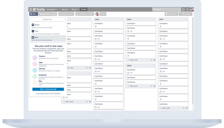
Based on our findings, people want a simpler mode to view and navigate the Trello board. So we need to give users a way to customize their views, without having to pay for the Premium account. Our proposal was to build into the Trello switch view menu 3 new viewing options – “Tree (Table of Contents), Grid, and Wall” views – that would allow for simpler visualization and intuitive navigation of the Trello board.
UX Design
FEATURE ROADMAP
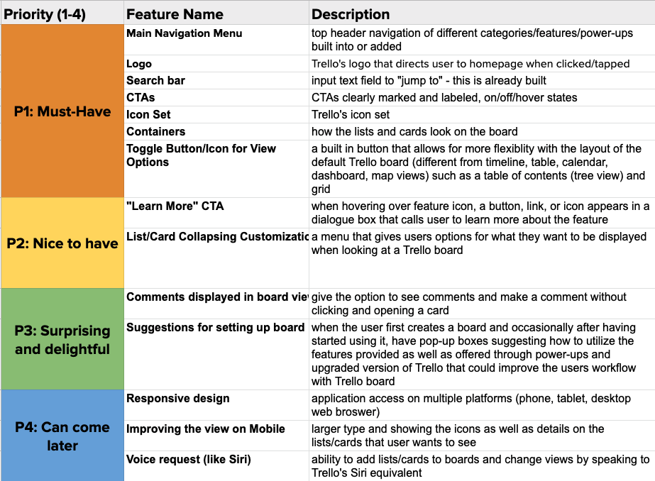
Keeping Jake, the user persona, and his needs at the forefront of my mind, I prioritized the features to include or design as part of the user flow for toggling the 3 viewing options. Some inspiration from other applications like Padlet and Google Calendar helped me consider design and usability patterns users are familiar with for viewing and interacting with a board.
USER FLOW
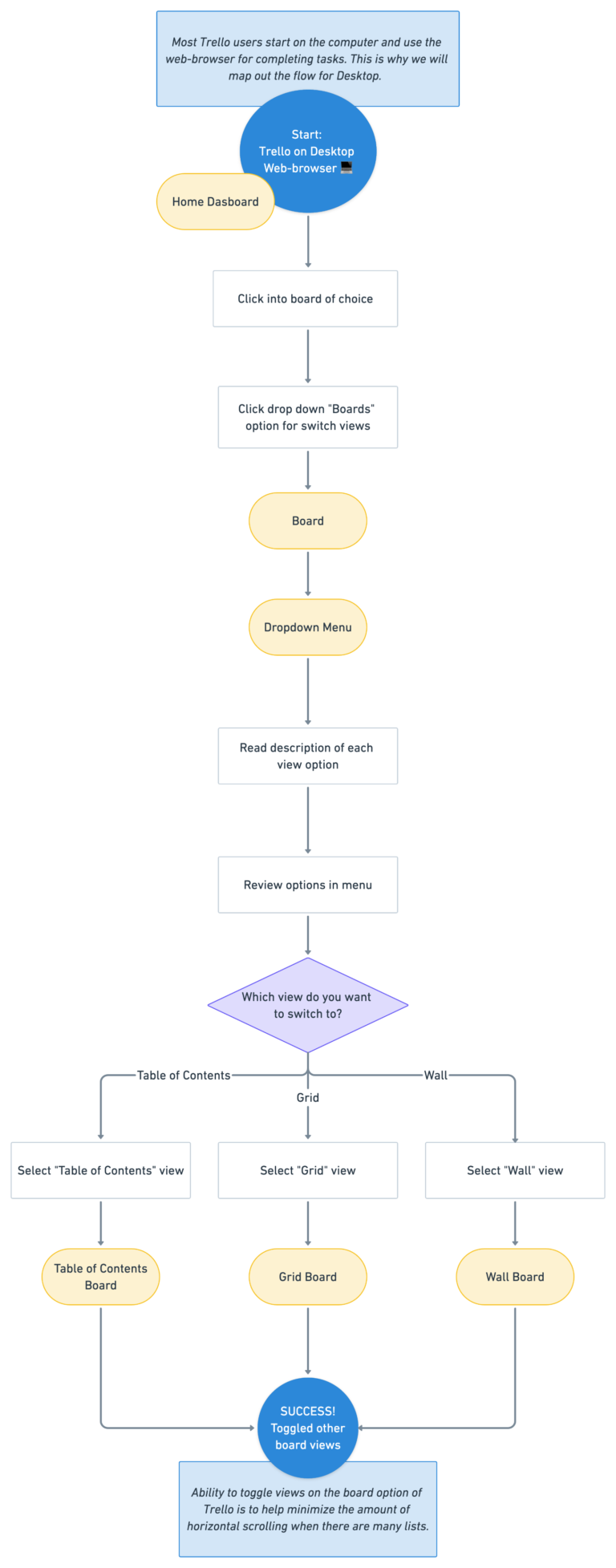
I mapped out the main user flow for toggling between board views in Whimsical to determine the screens and elements needed for efficient and intuitive functionality of the new toggle view feature. I incorporated what I learned during an observation made of a participant from a user interview and my own testing of the “Business Class” features and power-ups.
IDEATION
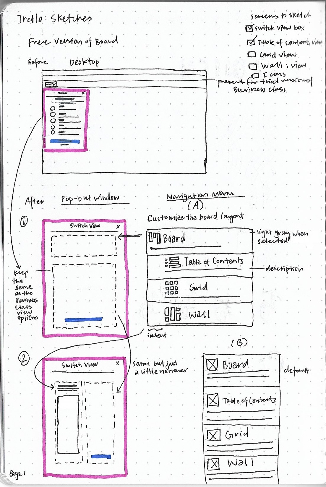
I began by sketching a new version of the dropdown menu to include the new toggle view options. Since I was adding functionality to the “Board” switcher, I chose to add the 3 new views as sub-options under “Board” so that current Trello users could more easily distinguish that these options are free in comparison to the “Business Class” options.
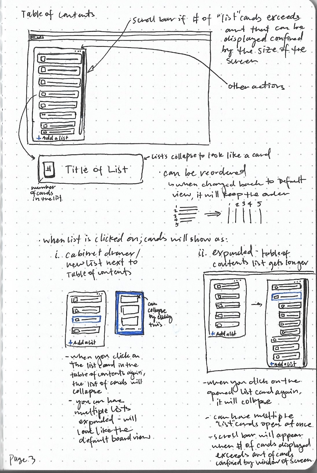
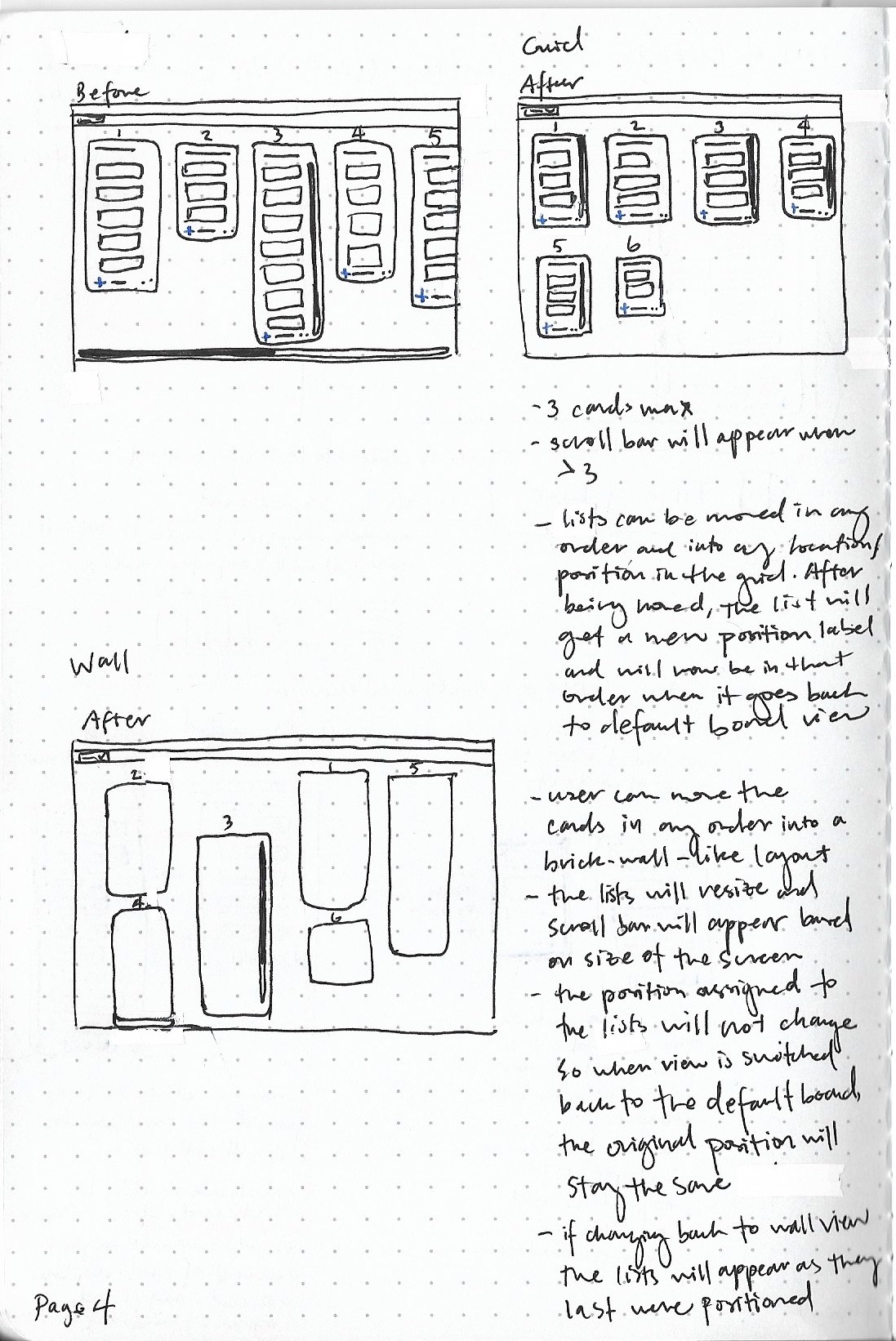
I also explored how to layout the lists and cards for each view, with the goals of minimizing horizontal scrolling and increasing user control and freedom to customize the layout to fit their productivity needs.
WIREFRAMES
Keeping the basic navigation and layout of the Trello board as is in these mid-fidelity wireframes, three main layouts were added to convey the “Table of Contents”, “Grid”, and “Wall” views. In order for users to understand the differences, I wanted to include an icon representing the view, as well as a descriptive name and caption for each, which is also consistent with Trello’s current presentation of different board views. Usability testing was conducted using a prototype of these mid-fi wires to ensure that Trello users were able to navigate the new feature. A clickable prototype is on the right and also available on Figma
Testing & Iterations
USABILITY TESTING
Methodology
Moderated testing of the mid-fidelity desktop prototype (above)
There were 5 participants total between the ages of 23-29; 4 of these 5 had been part of the initial survey pool.
Participants were asked to:
(1) open “Table of Contents” view
(2) navigate and toggle “Table of Contents” view
(3) navigate and toggle “Grid” view
(4) navigate and toggle “Wall” view
Results
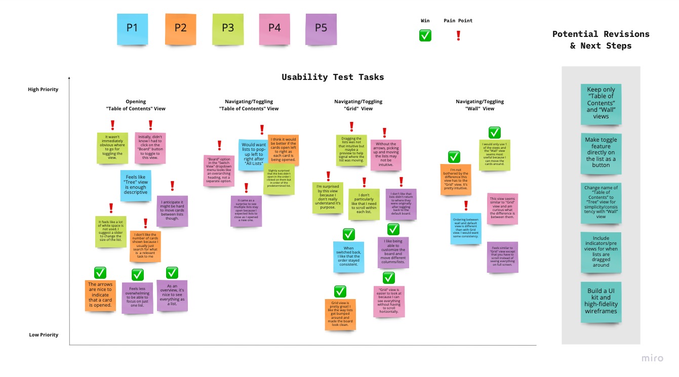
Organizing my notes of the usability test sessions in an affinity map, created in Miro, helped me to better visualize how to prioritize iterations for a higher fidelity prototype. Overall, the feature was well-received and I was able to also deepen my understanding of gaps in functionality based on pain points discovered in the usability tests.
KEY TAKEAWAYS
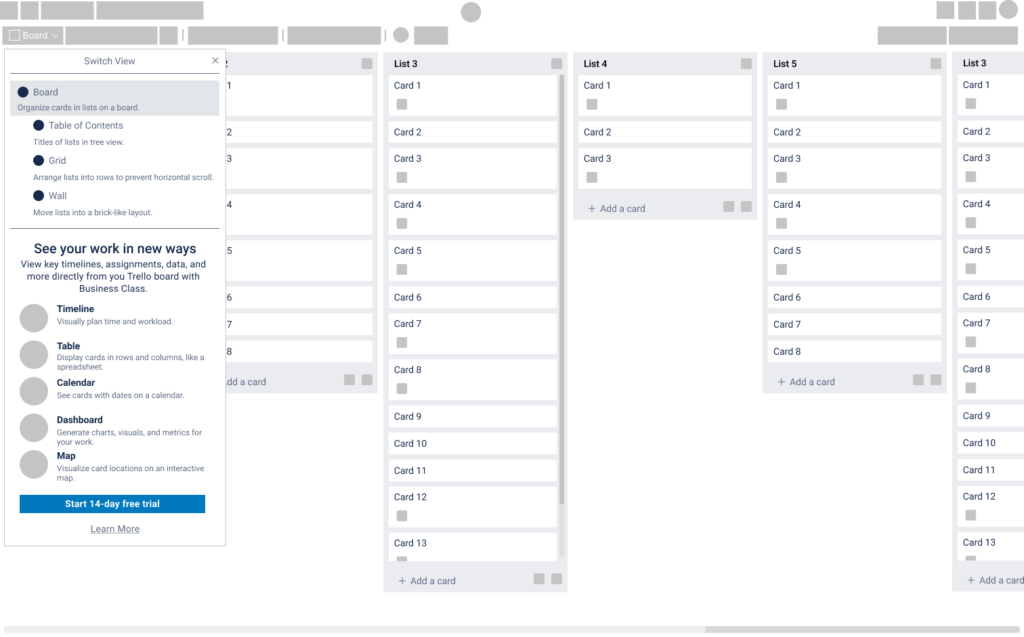
1 Some participants did not understand the difference between the “Grid” and “Wall” views, mentioning that what might make the feature more user-friendly and something they would consider using is providing fewer options.
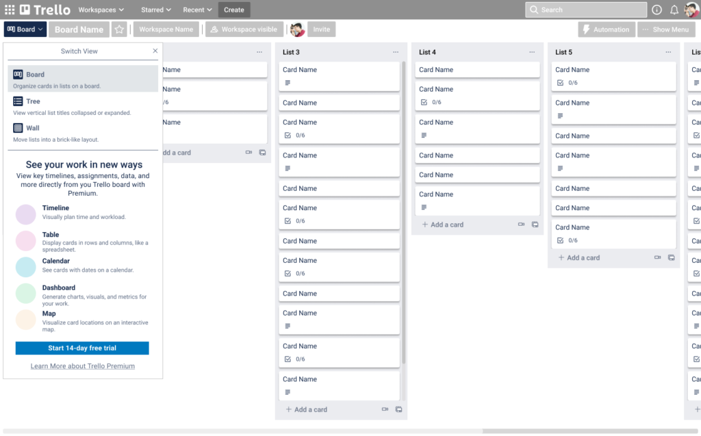
Fix: change 3 toggle view options (“Table of Contents, Grid, and Wall”) to 2 views (“Tree and Wall”) in addition to current “Board” view
2 I learned that, in general, most Trello users are unaware of the “Board” switch view that is a built-in feature already. So, to increase user learnability, I realized that this button needed to be more obvious and accessible for users to even notice it.
Fix: change the “Board” switch view button to a recognizable brand color that can draw attention to the user
Before
After
Visual Design
From the beginning of my design process for this project, Trello underwent minor UI/UX enhancements to it’s header element which I replicated after completing the first usability tests with the mid-fidelity wireframes.
ICONOGRAPHY
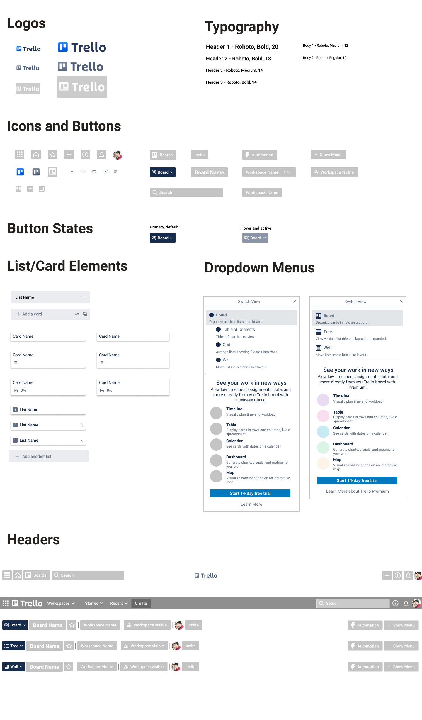
As the toggle features for “Tree and Wall” views were new to Trello, I sketched and designed new icons for these to stay consistent with Trello’s use of icons + labels for the “Board” switch views button. I used Padlet’s icon set as an inspiration when exploring different ways of conveying “Tree” and “Wall view”. Also, key words like table of contents, bullet point list, grid, and gallery helped guide the development of these icons.
UI KIT
Other visual design elements such as the icons, buttons, and list/card elements were replicated in Figma to create a design system (see UI Kit) to keep consistency as well as promote efficiency in the iteration phase. The UI elements I modified to incorporate the toggle views include the dropdown menu and list card with the number of cards contained in that list.
HIGH-FIDELITY SCREENS
After synthesizing the insights from the usability test results, I incorporated the pertinent feedback and possible revisions into hi-fi screens which were used in the updated version of the prototype.
(Clickable prototype below and also available on Figma)
Evaluation & Reflection
SOME ASSUMPTIONS
We assumed that users initially start out liking Trello because it is free, easy, and flexible to use; but later find there are constraints which other productivity tools do not have. We also assumed that improving the layout and navigation of Trello boards is one of the greatest pain points for users.
WHAT I LEARNED
There’s a lot of Trello features, even free ones, available to people – particularly, power-ups, but it does not seem obvious or easily accessible for users. When I chose to build my toggle feature with the existing elements on the header, I learned through interviews and usability testing that the “board switch” button was often overlooked. I also learned that many users like that Trello allows them to customize cards by labelling them with colors which helps them quickly scan as well as organize their Trello board. So I chose to make the “board switch” button more obvious by changing the color to distinguish it from the rest of the header buttons.
NEXT STEPS
1 Knowing that a toggle feature exists may still not be obvious or accessible to users. So more usability testing and iterations on the visibility of this feature could increase user interaction and satisfaction.
2 For improving user learnability, I would also like to develop pop-up tutorials with instructions such as how Google and Apple provide both new users and occasionally as a refresher for current users of their products.
3 There is so much more to learn from users of the mobile version of Trello on how to better improve their experience with navigating the Trello board. If I had more time, I would conduct research and testing of a mobile prototype.
Next Project:
